
393 Shades of Light Color
Light color shades create breathing room in any design. Explore these airy tones with hex codes, giving designers a toolkit for clean, minimalist aesthetics that enhance readability and reduce visual clutter.
-
#acdfdd

Blue Light Color
A pale, cool blue with a green undertone. Blue light color (#acdfdd) is the shade of shallow pool water photographed on a bright day. Reads fresh and slightly retro, useful for coastal branding and vintage bathroom tile.
-
#55bb33

Exit Light Color
Building codes in most of North America require exit signs to fall within a narrow range of bright green. Exit Light color (#55bb33) sits right in the center of that range, designed so eyes can find it in low light and through smoke. Outside emergency design, the Exit Light color carries that same urgency into sportswear, gaming UIs, and energy drink labels.
-
#b0c4de

Light Steel Blue Color
Steel blue with a spoon of cream stirred in. Light steel blue color (#b0c4de) has a dusty quality that reads as calm and slightly nostalgic, which is why it shows up in retirement community branding and vintage porcelain. Try it beside brass or taupe.
-
#add8e6

Light Blue Color
Named exactly what it is. Light blue color (#add8e6) is the crayon-box version of a July sky, cheerful without going childish. Bedding companies use it constantly because it registers as clean and restful to nearly everyone who sees it.
-
#e0ffff

Light Cyan Color
Barely cyan at all, almost a tinted white. Light cyan color (#e0ffff) works beautifully as a background wash in medical, dental, or hygiene branding where you want cool without cold. Any darker text lands comfortably on top of it.
-
#76ff7b

Light Green Color
Uncomfortably bright, almost radioactive. Light green color (#76ff7b) is what fluorescent poster paint looks like on screen, useful for warning states, gaming UIs, and anything that needs to shout “alive.” Belongs almost nowhere in interiors.
-
#f3d3d9

Light Red Color
The name is a stretch. Light red color (#f3d3d9) is really a pale dusty pink with a warm undertone, closer to blush than actual red. Wedding invitations, cosmetics packaging, and children’s rooms all lean on it despite the misleading label.
-
#d8dcd6

Light Grey Color
The default choice that nobody regrets. Light grey color (#d8dcd6) has a whisper of green in it, which is the tiny detail that keeps it from feeling like hospital linoleum. Walls, packaging, dashboards, wedding invitations: this shade works everywhere because it politely refuses to compete.
-
#fffe7a

Light Yellow Color
Butter, sunshine, and a highlighter that’s already fading. Light yellow color (#fffe7a) is friendly at small sizes and overwhelming at large ones, so use it sparingly. Great for warning banners, packaging accents, and citrus branding.
-
#f0f4f8

Child of Light Color
Child of Light is a soft, almost weightless color. It lives in the very palest part of the blue-gray family. Technically, it’s a near-white with a slight cool tint—closer to clouded sky than pure snow.
-
#a8d3e1

Light Blue Glint
-
#cdc7bd

Micaceous Light Grey
-
#e2f0d2

Light Greenette
-
#acd6db

Light Jellyfish Blue
-
#add2e3

Light Bobby Blue
-
#b7c9e2

Light Blue Grey
-
#f0e1db

Sahara Light Red
-
#acdce7

Light Washed Blue
-
#c2d2d8

Light Pure Blue
-
#d5d0cb

Light Taupe White
-
#e6e6d0

Light Fern Green
-
#c6d4e1

Light Cameo Blue
-
#c0d8eb

Light Blue Veil
-
#cbd9d8

Raffia Light Grey
-
#c9d4e1

Light Angora Blue
-
#dbd5ce

Light Limed White
-
#cedcd6

Light White Box
-
#c6dde4

Light Blue Sloth
-
#c8d8e8

Light Placid Blue
-
#d2d3e1

Light Blue Cloud
-
#2dfe54

Bright Light Green
-
#8c9900

Traffic Light Green
-
#00a267

Emerald Light Green
-
#b5651d

Light Brown
-
#b1fc99

Pale Light Green
-
#a6fbb2

Light Mint Green
-
#a7ffb5
Light Seafoam Green
-
#bf3160

Maroon Light
-
#e7d1dd

Light Flamingo Pink
-
#8fb2a3

Chrysopal Light Green
-
#c1cab7

Jade Light Green
-
#bcc9c7

China Light Green
-
#cbdcb7

Pallid Light Green
-
#acbf69

Light Olive
-
#d1dbc7

Duchamp Light Green
-
#73705e
Sage Green Light
-
#d5d8c9

Light Green Alabaster
-
#d7ddcd

Light Green Ash
-
#c9cfcc

Light French Grey
-
#d4e6d9

Light Green Wash
-
#e5f4d5

Light Green Glint
-
#e8f4d2

Light Green Veil
-
#c4d9ef

Light Powder Blue
-
#e9eadb

Really Light Green
-
#b1ccc5

Light Teal
-
#a38a83

Light Caramel
-
#ffd1df

Light Pink
-
#f0f4f8
Child of Light
-
#15151c

Absence of Light
-
#ff44ee

Actinic Light
-
#a6a8c5

Wisteria Light Soft Blue
-
#fae8c8

Washed in Light
-
#fff9d8

Warm Light
-
#dfd3cb

Vision of Light
-
#0098c8

UV Light
-
#dac0cd

Twilight Light
-
#93bcbb

Turner’s Light
-
#9cd572

Tropical Light
-
#fbedb8

Tinker Light
-
#fde4b4

Tiffany Light
-
#f6f4ef

The Speed of Light
-
#002288

There Is Light
-
#f8e4c2

Tea Light
-
#f7d60d

Tau Light Ochre
-
#f7f2dd

Tapering Light
-
#5599b6

Steel Light Blue
-
#fff4dd

Stellar Light
-
#faf0c9

Solar Light
-
#cadade

Sky Light View
-
#cddad3
Silicate Light Turquoise
-
#550011

Saving Light
-
#cdc7b4

Sapphire Light Yellow
-
#b2c8dd

Ridge Light
-
#fdf2c0

Ray of Light
-
#ff0055

Red Light Neon
-
#f6f3e7
Rapture’s Light
-
#130173

Quantum of Light
-
#036c91

Pure Light Blue
-
#e2ded8

Poetic Light
-
#ff2277

Office Neon Light
-
#a7aeb4

Northern Light Grey
-
#96aec5

Nordland Light Blue
-
#ffdf5e

Neon Light
-
#f1ebc8

Natural Light
-
#e9b6c1

Naked Light
-
#dde5ec

Mystic Light
-
#e0efe9

Morning Light Wave
-
#d7cfc2

Mocha Light
-
#dfe9de

Meadow Light
-
#bbaeb9
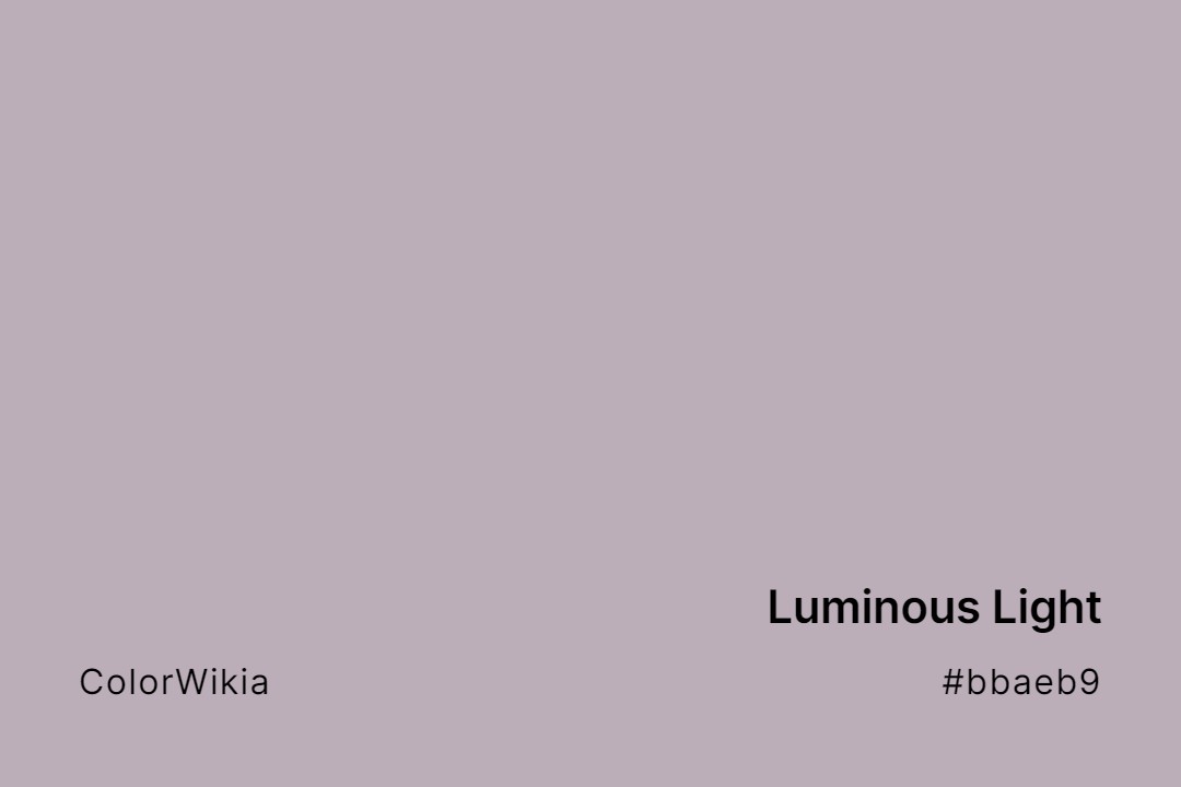
Luminous Light
-
#c2ceca
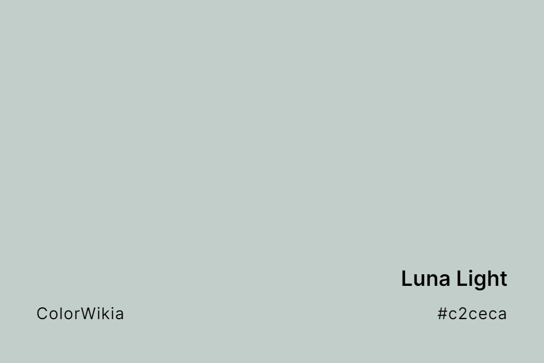
Luna Light
-
#9b959c

Lunar Light
-
#a18899

Lively Light
-
#dccab7

Loft Light
-
#cdc2ca

Limpid Light
-
#d0756f

Light Tomato
-
#f5ecdf
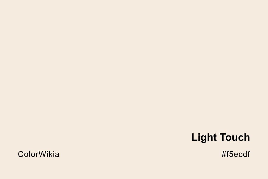
Light Touch
-
#7ef4cc

Light Turquoise
-
#bfe7ea

Light Vandamint
-
#d6b4fc

Light Violet