
172 Shades of Dark Color
Explore different types of Dark colors for your website, brand or any project.
-
#003377

Dark Midnight Blue Color
Universities, banks, and law firms pick it for the same reason: it reads as “serious” without trying. Dark Midnight Blue color (#003377) is a deep cobalt-leaning navy with enough depth to feel weighty. Pair with gold and warm cream for brands that want to look like they’ve been around for a century.
-
#214761

Dark Slate Blue Color
Cold, deep, and a touch corporate. Dark slate blue color (#214761) is a muted navy with a grey undertone, which lets it read serious without going harsh. Perfect for financial services websites, blazer linings, and any design that needs to feel dependable.
-
#454636

Dark Olive Green Color
Muddy, moody, and grown-up. Dark olive green color (#454636) reads like the inside of a wax cotton jacket, which is exactly why heritage clothing brands lean on it. Best with mustard yellow, camel, and cream.
-
#315b7d

Dark Blue Color
A working-hours color. Dark blue reads corporate but not cold, the shade of law-firm websites and airline uniforms since forever. Comfortable beside grey and white, but it fights every warm red and orange it meets.
-
#008b8b

Dark Cyan Color
A saturated teal-cyan with real punch behind it. Dark cyan color (#008b8b) is the color of chalkboard slate mixed with tropical water, and it works surprisingly well as a strong accent for tech branding. Warm oranges and creams keep it grounded.
-
#033500
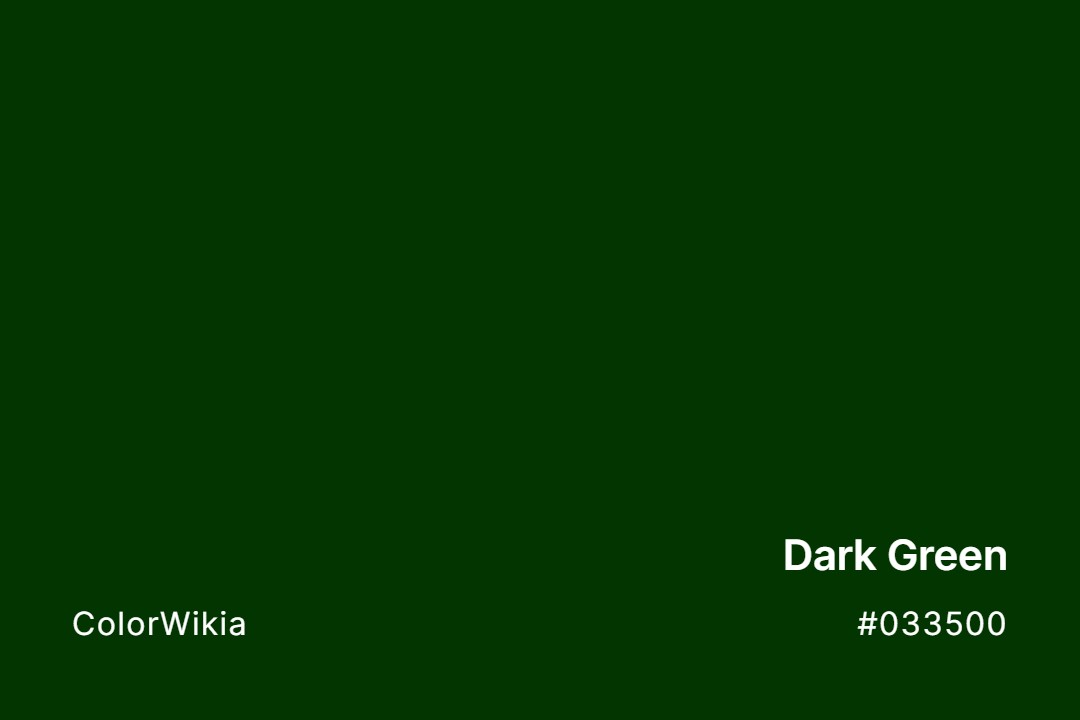
Dark Green Color
Think of a spruce forest at dusk, right before the details go black. Dark green color (#033500) is heavy, grounded, and unusually good at making brass and gold accents pop. Cabinet fronts and library walls are its natural habitat.
-
#363737

Dark Grey Color
A working color, not a decorative one. Dark grey color (#363737) shows up in text weights, UI dividers, and every professional slide deck for a reason: it reads serious without shouting. On walls, though, it can turn moody fast if the room lacks natural light.
-
#8b008b

Dark Magenta Color
A saturated purple-pink with the intensity of a stage light. Dark magenta color (#8b008b) took over graphic design in the mid-2000s and never fully left. Anchor it with black or dark grey; it fights with warmer reds.
-
#c65102

Dark Orange Color
Burnt sienna’s slightly angrier sibling. Dark orange color (#c65102) reads like clay pots, autumn leaves, and construction cones, all at once. Pair with dark green or navy to keep it from tipping into Halloween.
-
#840000

Dark Red Color
Dried blood and old velvet drapes. Dark red color (#840000) feels theatrical and expensive, which is why wine labels and hotel logos love it. Not a friendly color, but it commands the room.
-
#193232

Dark Pine Green
-
#0d2b52

Dark Tyrian Blue
-
#6e576b

Dark Purple Grey
-
#404034

I R Dark Green
-
#7ebd01

Dark Lime Green
-
#666655

Dark Seagreen
-
#006d57

Teal Dark Green
-
#565c4a

Rookwood Dark Green
-
#2f4f4f

Dark Slate Grey
-
#33578a

Dark Cobalt Blue
-
#004f39

Chrysocolla Dark Green
-
#00334f

Dark Denim Blue
-
#cb416b

Dark Pink
-
#373e02

Dark Olive
-
#3c0008

Dark Maroon
-
#35063e

Dark Purple
-
#40495b

Dark Navy
-
#e7bf8e

Dark Yellow
-
#014d4e

Dark Teal
-
#855e42

Dark Wood
-
#0011bb

Too Dark Tonight
-
#0f4d5c

Teal Dark Blue
-
#ff7711

Sparks In The Dark
-
#110055

Scoop of Dark Matter
-
#5f4d43

Rookwood Dark Brown
-
#4b2929

Rookwood Dark Red
-
#313390

Perfect Dark
-
#004c6a

Navy Dark Blue
-
#3b3c41

In the Dark
-
#005456

Ice Dark Turquoise
-
#befdb7

Glow in the Dark
-
#56443e

Dark Walnut
-
#1b2431

Dark
-
#34013f

Dark Violet
-
#151517

Dark Void
-
#817c87

Dark Topaz
-
#594d46

Dark Truffle
-
#045c5a

Dark Turquoise
-
#932904

Dark Umber
-
#141311

Dark Veil
-
#303b4c

Dark Spell
-
#7e736d

Dark Sting
-
#80444c

Dark Strawberry
-
#383839

Dark Summoning
-
#483c3c

Dark Taupe
-
#634e43

Dark Tavern
-
#a3a3a2

Dark Souls
-
#414a4c

Dark Space
-
#909989

Dark Sky
-
#465352

Dark Slate
-
#66aa11

Dark Slimelime
-
#587a65

Dark Sorrel
-
#112255

Dark Soul
-
#3e5361

Dark Secret
-
#113311

Dark Serpent
-
#4a4b4d

Dark Shadow
-
#5b595d

Dark Shadows
-
#33cc99

Dark Shamrock
-
#004444

Dark Side
-
#3c1414

Dark Sienna
-
#a88f59

Dark Sand
-
#082567

Dark Sapphire
-
#4c5560

Dark Sea
-
#c85a53

Dark Salmon
-
#3f012c

Dark Sanctuary
-
#4a2d2f

Dark Roast
-
#626d7b

Dark Room
-
#b5485d

Dark Rose
-
#02066f

Dark Royalty
-
#45362b

Dark Rum
-
#6d765b

Dark Sage
-
#a2646f

Dark Sakura
-
#505838

Dark Rainforest
-
#872657

Dark Raspberry
-
#3b5150

Dark Reaper
-
#840000
Dark Red
-
#060b14

Dark Rift
-
#3e4445

Dark River
-
#2e2d30

Dark Onyx
-
#c65102
Dark Orange
-
#251b19

Dark Orchestra
-
#653d7c

Dark Pansy
-
#665fd1

Dark Periwinkle
-
#606865

Dark Pewter
-
#603e53

Dark Potion
-
#6b6c89

Dark Prince
-
#4f3a3c

Dark Puce
-
#110101

Dark Matter
-
#515763

Dark Mineral
-
#161718

Dark Moon
-
#404b57

Dark Night
-
#8b008b
Dark Magenta
-
#482029

Dark Mahogany
-
#994939

Dark Marmalade
-
#0b3021

Dark Jungle
-
#151931

Dark Knight
-
#6a7f7d
Dark Lagoon
-
#856798

Dark Lavender
-
#9c6da5

Dark Lilac
-
#84b701

Dark Lime